

romance graph
here is a very rough sketch of a graph i designed.
now, i don't fancy myself a mathematician of any kind, and perhaps that is why i am so taken with it. after all, to novices like me numbers don't lie. okay, i realize there are no numbers on this thing so let me explain.
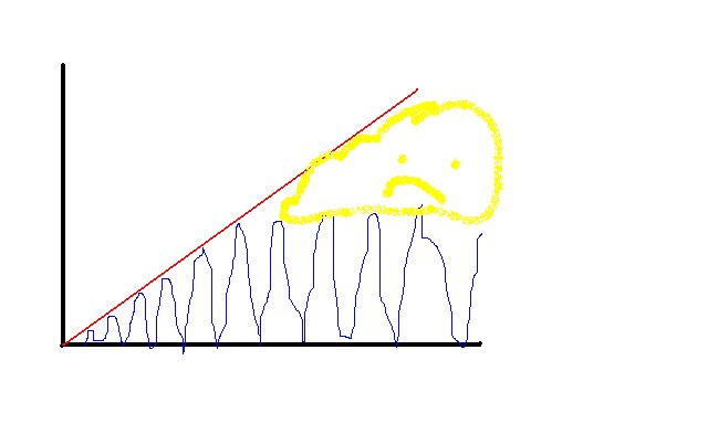
this graph represents the development of the average relationship over time. the red line represents the girl's progression of feeling, which, once it is set in motion, generally tends to increase steadily if there are no major obstacles in the way. i suppose it could have an ascent that is more or less steep, depending on how much of a psycho or a romantic you are, but for the sake of uniformity, lets just say this is average.
the blue line represents the male progression of feeling over time, which careens erratically between caring more or less about the situation, but can generally be expected to follow the pattern of up and down once it gets going. this is why, for example, upon meeting a girl, a guy will be gung-ho about calling, texting and expressing himself for a minute, but once he encounters the girl's corresponding demonstration of feeling, he will disappear for about a week or so.
now all of this is well and good, as long as the "maxima", or peak (thanks karl) of the boy line periodically reaches the ever increasing level of the girl line. in other words, as long as you keep calling, my level of interest will remain on the up-tick.
but then there is what i call the "danger zone". this is represented by the nebulous yellow area with the sad face inside it. this is the space that a couple encounters when a guy's interest in the relationship peaks at a certain level and no longer extends beyond it, even on the best of days. the girl line, however, in its steady fashion, continues on its incremental path. this is the time when we start freaking out and guys start disappearing for real. in fact, it might have been better to show the blue line start decreasing in general intensity here, but i am no graphic designer.
as long as the two lines continue to touch occassionally, and the red line eventually begins to plateau, then all is well. but as i have discovered, this is a notoriously difficult balance to obtain. and although the graph doesn't show this, if the danger zone begins to takes up a significant amount of space (say, more than what the entire progression consisted of before its appearance), the red line will take a definitive plunge downward, and this will most like take the form in real time of a crying fit, and proclamations of the guy's inherent tendency toward selfishness, assholedom and an inability to truly love.
so there you have it. learn it and live it. i know some of you out there will say it is essentializing, but i am not making any claims about anyone's inherent way of being. i think its pretty much all nurture driven, and while i won't go into why people end up behaving along these lines, suffice it to say that i think there is something to this. let me know what you think.
posted by chiara @ 1:52 AM
0 comments
![]()